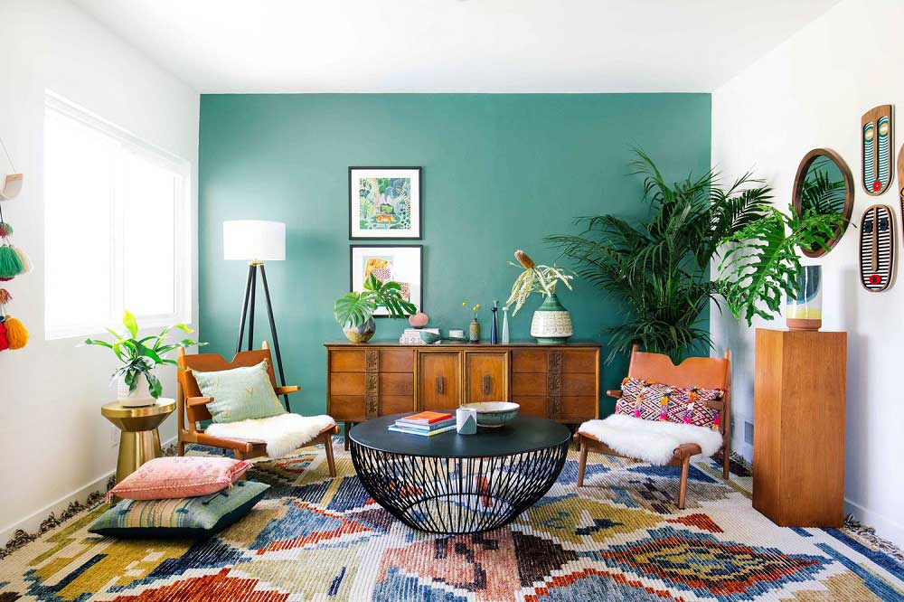
No matter how much budget you have for home decoration, there will be always some space left empty. These empty corners can affect the whole interior and look awkward. But seeing empty spaces as a disaster, I suggest to consider it as an opportunity. How? Well, when we are buying decorative pieces, we are just thinking of the trend and look. It has nothing much to do with our needs. So, when you are done creating desire classy look, corners can be used to meet your needs. Thus, every empty corner requires an extra shopping to serve as an organizer. Here are some decorating ideas for empty corners.
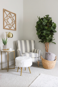
Our first empty space solution is indoor plants. Though I think greenery should get priority on first place but many forget to include. That is why I’m suggesting plants for corner’s interior. Plants are both useful and decorative. It brings live to place and spread energy. Succulents, money plants are some easy to grow options. You can also place flower plants for a corner in room.
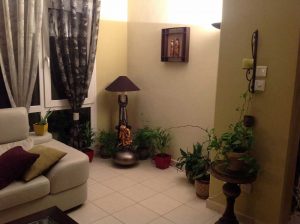
Another great idea is lamps. Choose a tall lamp and place some other decorative piece around it. To avoid making a lamp look like a wall paint, complementary pieces should be of varies in height and create a pattern.
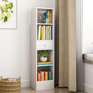
Like common places, corners in private spaces like bedroom and bathroom need little extra love too. Place stylish shelf at these corners. To avoid looking over crowded, chose shelfs at a lower height. Be extra careful for the material. Moisture in bathroom can damage a wooden shelf.
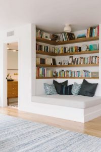
Books are a great way to make an ordinary looking place look aristocratic. Set up the books in cross row. Some vertically, some in horizontal position. In fact, colorful book cover can brighten up a left alone corner.
Lastly use empty corners for extra seating. Seats are never wasted as every weather and occasion demands different seating arrangement. Besides extra seats will make your extra guest to feel cozy and comfortable.
Here I’m done with 5 easy empty corner decorating ideas. But there are more plenty of ideas. No matter what you pick, try to be useful and standard. Since you are going to bring up the corners, it has to be relatable with the place. Otherwise, the whole place may look clumsy as a whole.
Fashionblitzs/Maria

